I was tasked with designing a productivity app with three pre-defined key functionalities for people who want to manage their study plans and to-do lists. I also needed to determine 2-3 additional functionalities based on competitor anlysis and deliver a set of icons.
Create a user profile
Create task lists
Mark tasks complete
Through competitor analysis, I discovered three functionalities that frustrated users of existing productivity apps. Poeple wanted to be able to tag tasks and events, nest lists and subtasks, and control their notification settings. These features were implemented into Tick Task to create a user-centric application.
Tag tasks and events
Nest lists and subtasks
Control notification settings
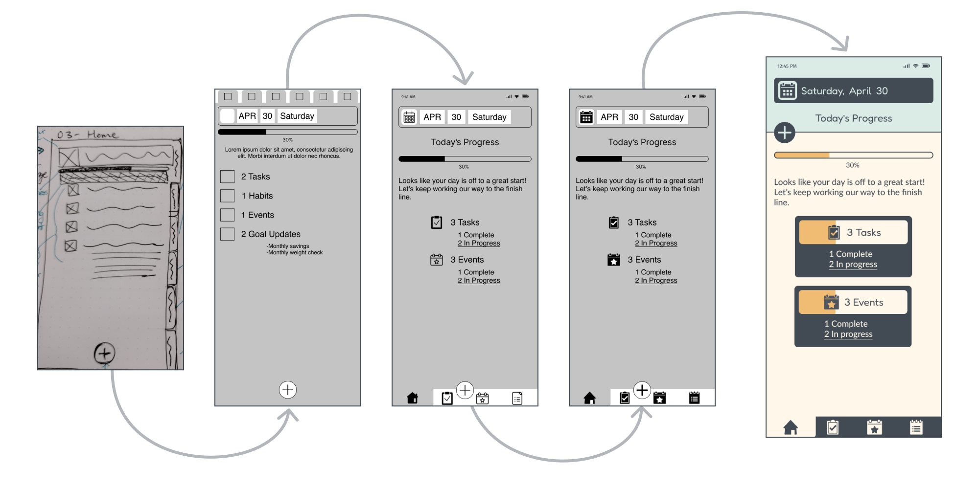
Once the funcitonalities were determined, the layout of each screen was built using a grid system. Design principles and patterns, such as gathering user input, navigation, and feedback were applied. The screens were iterated to refine the hierarchy and ensure UI elements were placed appropriately for a mobile platform. The home screen in particular went through several revisions.
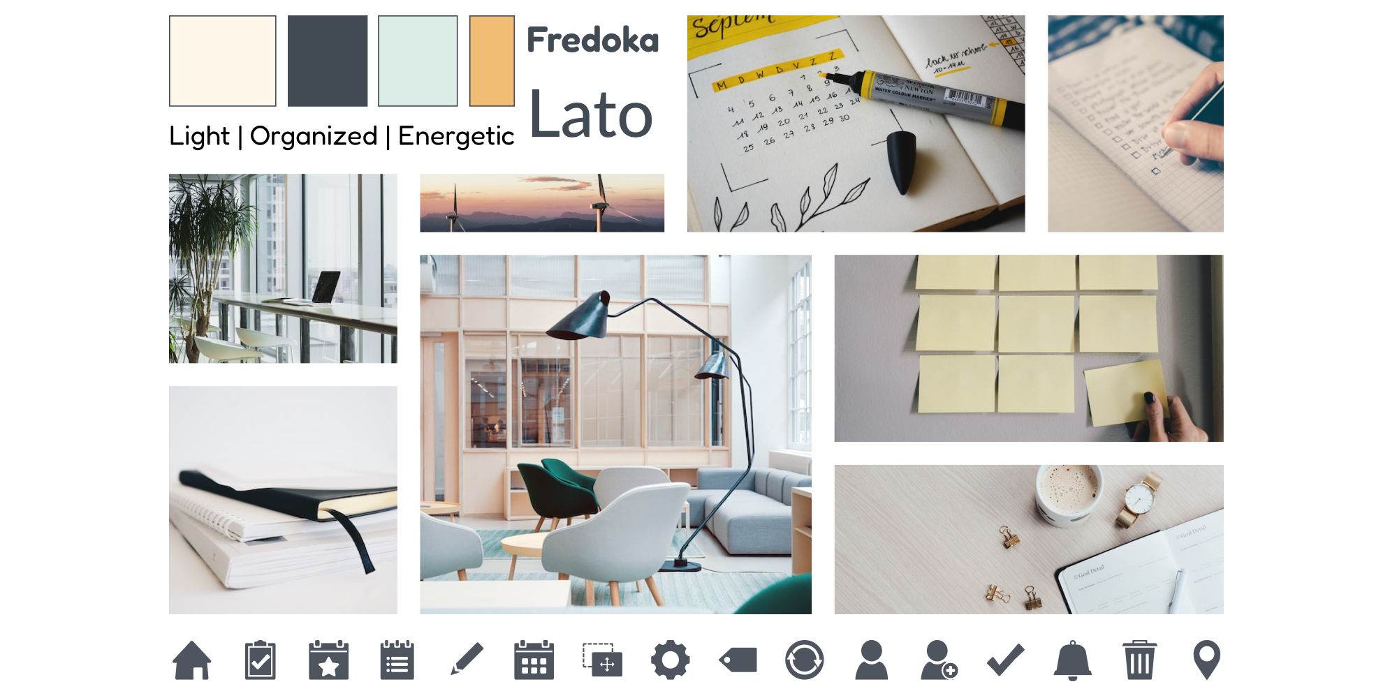
After the structure of the app was finalized, I gathered inspiration to develop a visual guide. I wanted the app to be light, organized, and evoke energy for the user to complete tasks and manage their activities. Filled icons were designt to communicate actions quickly.
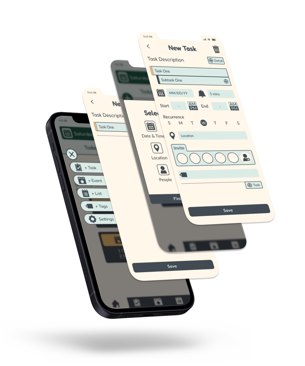
While there are six total functionalities of the app, four are highlighted to show UI elements unique to Tick Task. Users press the floating action button to add tasks, events, lists, tags, or access settings. When adding a task, the default screen provides a simple text input for quick saving or deletion. Alternatively, users can access a detail selector for date and time, repeat, location, subtask, people, and tag for additional task inputs.
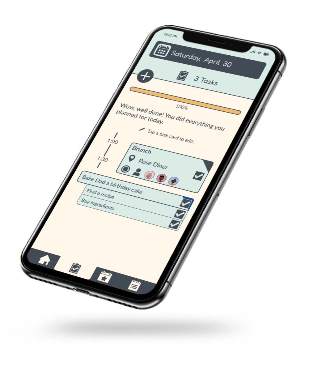
To mark tasks complete, users simply tap the checkbox on the corresponding card. As tasks are marked complete, the completeness meter near the top of the screen will fill toward 100%.
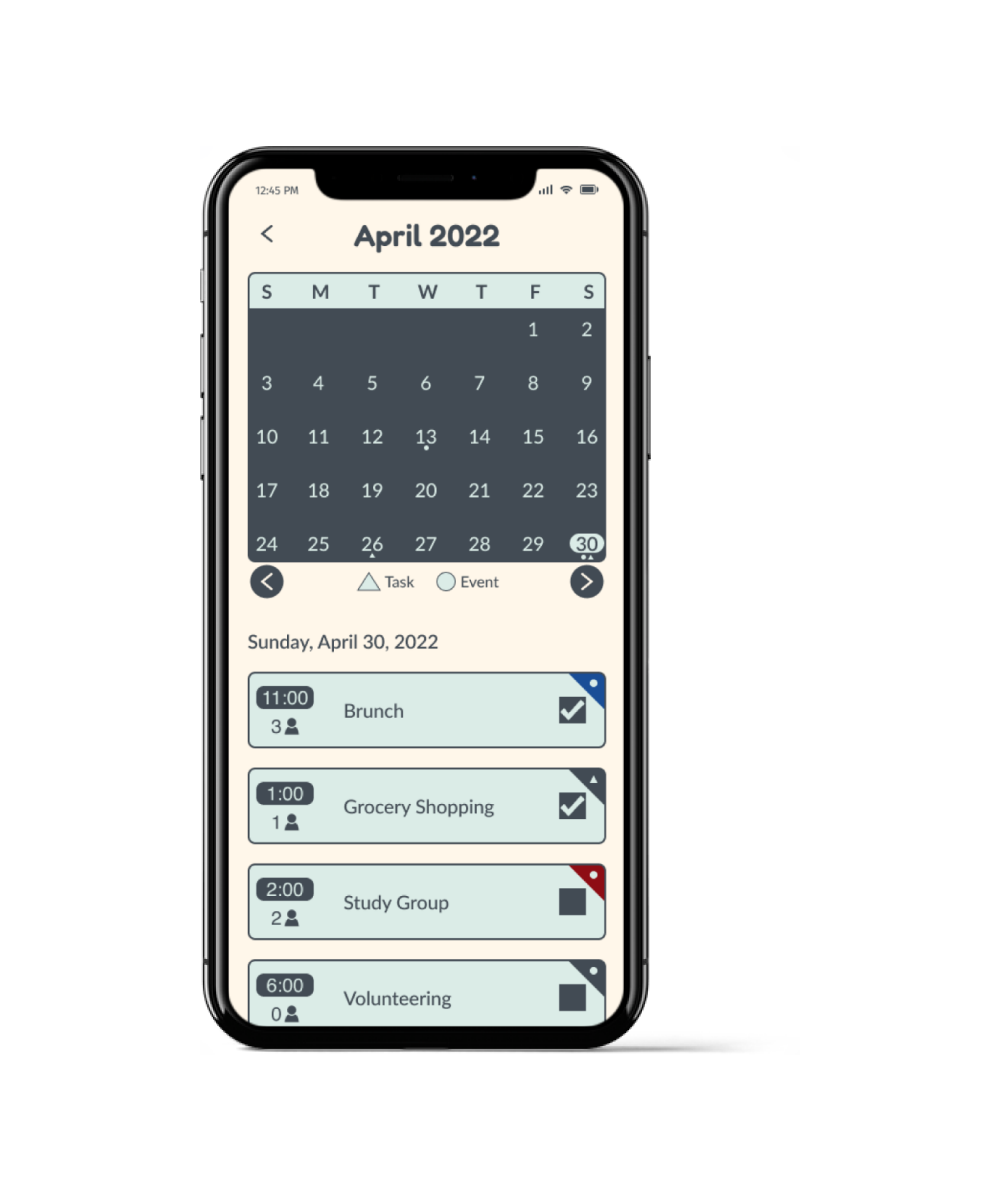
Events and tasks can be tagged with a color that the user chooses. Untagged items default to dark grey, and appear as corner flags. An example of tagged items is shown in the calendar view screen.
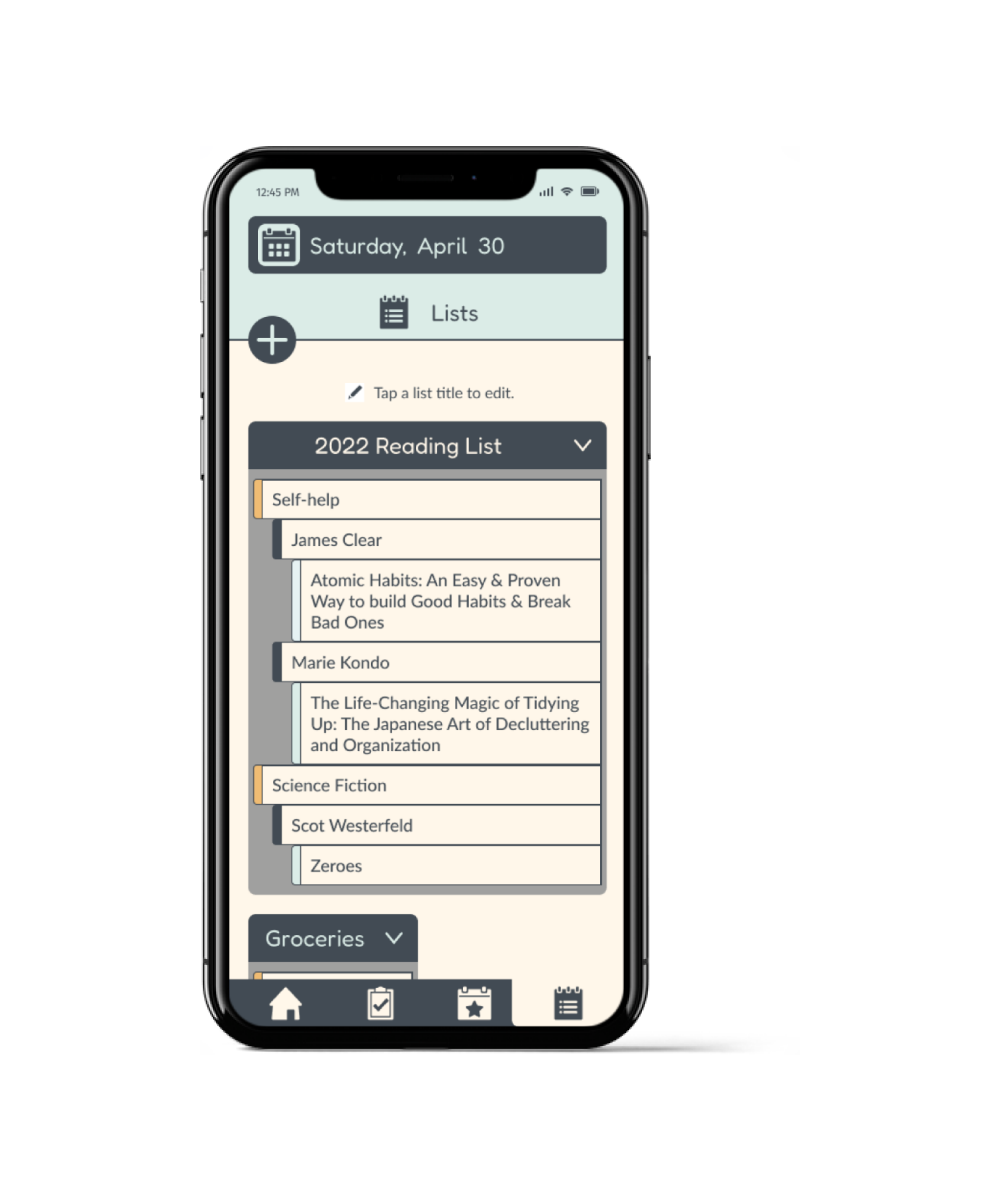
Long lists and short lists can be collapsed or expanded depending on user needs. Nesting of list items occurs in the edit screen where text inputs have a drag-and-drop interaction.
Moving forward, I would use a leaner approach. I started this project with too many ideas the the work scope grew, resulting in longer time required to complete the deliverables.
During this project, I also struggled with color management and needed to go through several revisions to achieve balance and accessibility.
Takeaways: