Traditional methods require people to keep a rarely opened folder full of papers.
Patient portal apps can store future medical data, but does not provide a way to upload historical documents before the first visit.
Existing medical record apps require extensive data entry from users, and can be time-consuming.
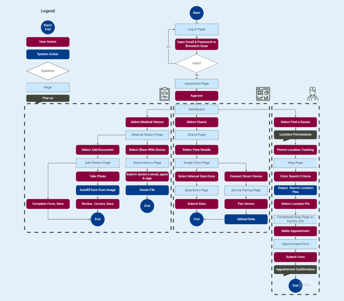
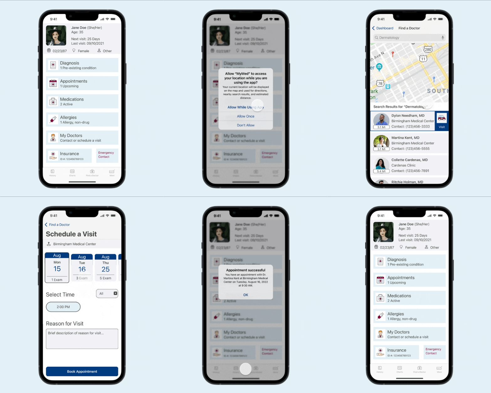
Locate nearby medical providers with your phone's GPS system and schedule an appointment.
View, update, and share your medical history with your doctors. Use biometric sign-in for added security.
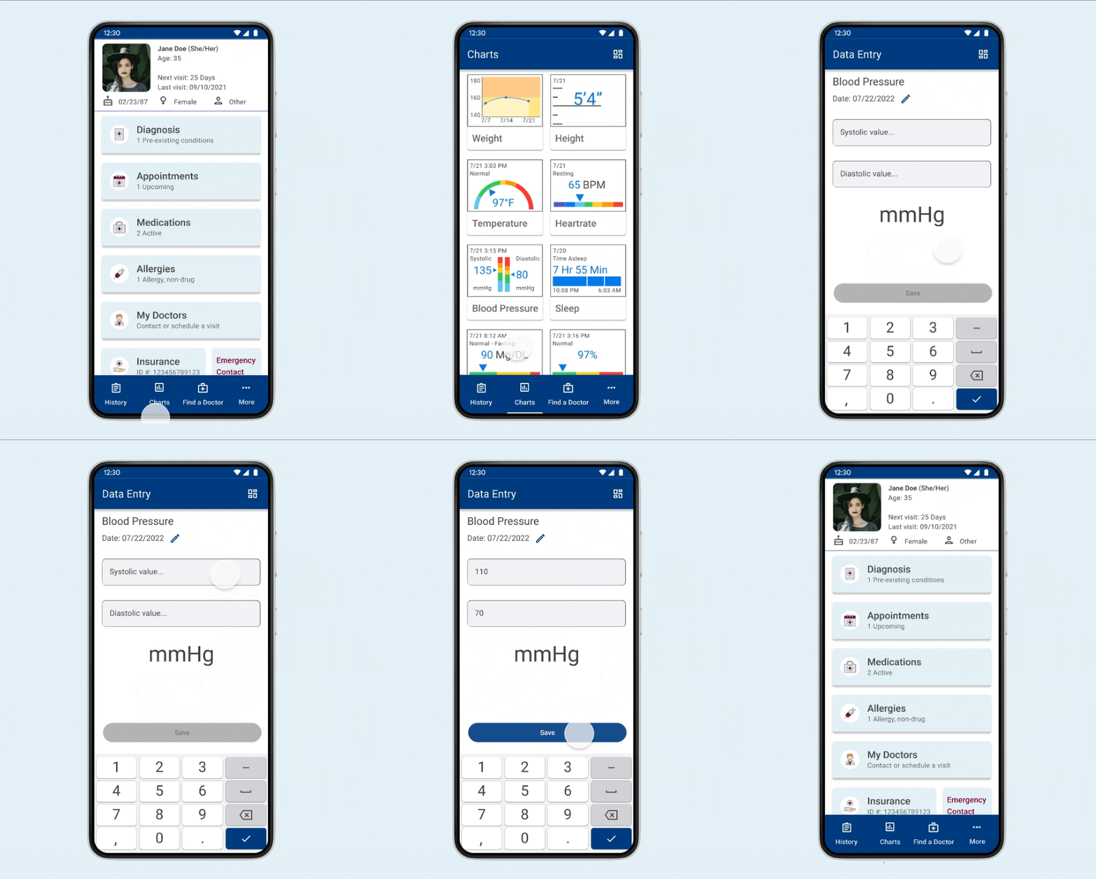
Visualize and understand vital signs and overall health with color-coded charts.
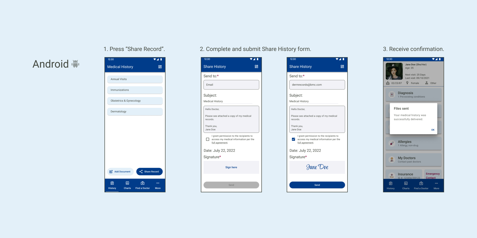
Press a share button and complete a short form that requires a recipient, agreement, and signature.
Enter data on the charts page using short forms. There will also be an option to connect smart devices for people who monitor their vitals regularly.
Input notes manually, or take a photo of the document that will be scanned and processed by the app.
Search the map page to find nearby medical professionals. The search results can be browed and selected to make an appointment.
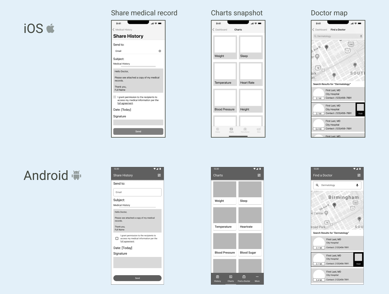
Wireframes for each screen were built using the iOS and Material guidelines. In this step, I learned about the key differences in UI elements such as the font and styles of tab bars, text fields, and buttons. The challenge I had with this step was determining the equivalent terminology to use when searching for guidelines. For example, since there are no cards in the iOS design system I needed to look at guidelines for boxes and collections.
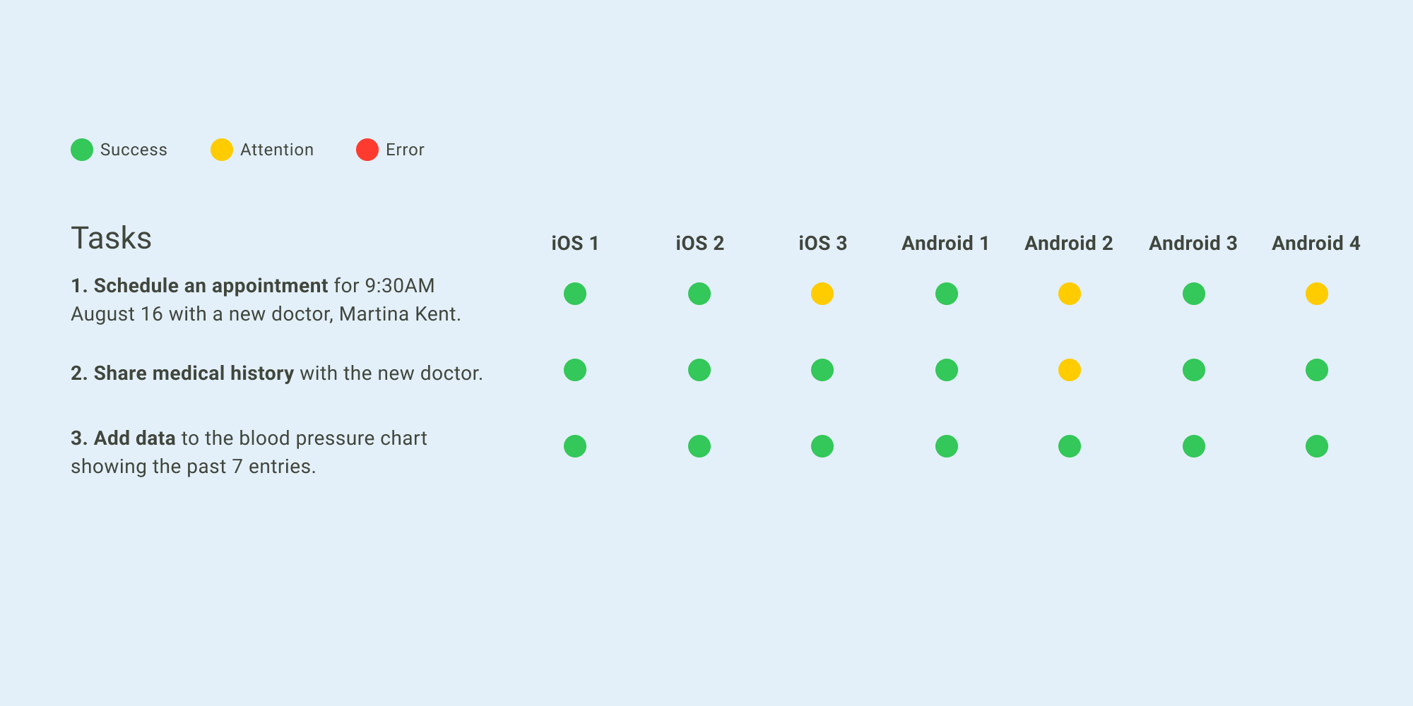
I set up a prototype for each platform and tested it with 3 iOS users and 4 Android users to see if my design worked. Some users found the first task confusing due to copy on the dashboard screen that read, "My Doctors: Contact and schedule an appointment". This confusion could be resolved by changing the copy of the "My Doctors" card.
Users gave feedback on some mistakes I had made in the design, such as not allowing users to find a doctor if they did not allow location tracking. They also commented on wanting more pop-ups for reminders and confirmations, as well as reconfiguring the dashboard cards to reduce confusion or improve visibility. More specifically, some users thought that the vital sign card was easily confused with the charts tab.
Some other interface changes include improving the signaling for entering data and containing overflow text on the Terms & Conditions page.
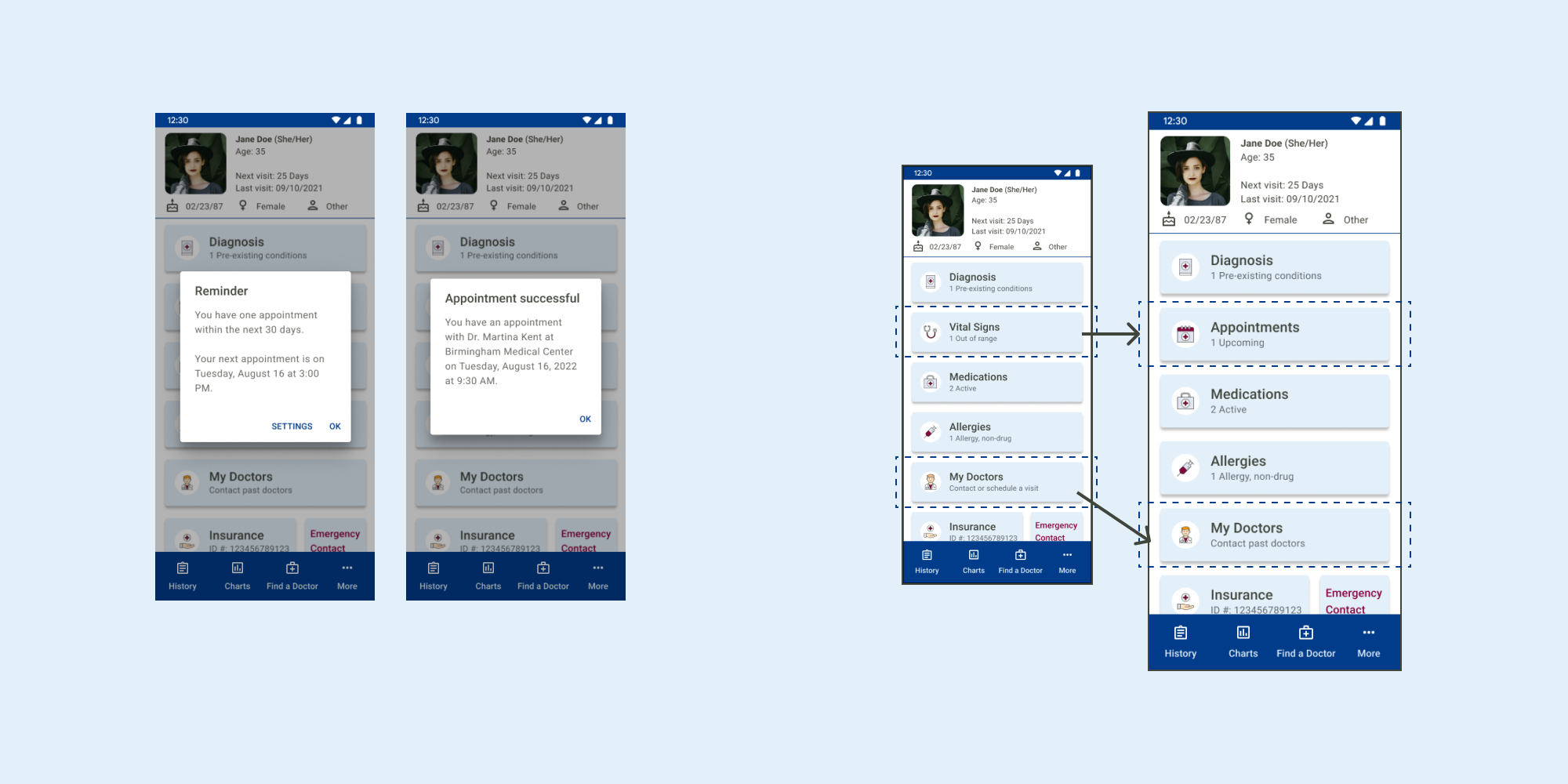
I pursued all changes to make the design user-centric. Moving the dashboard navigation to the tab bar was not completed due to space limitations. One user also felt that the chart colors clashed with the design, but additional preference testing indicated that the rainbow palette was preferred to understand the information.
To find a doctor, the user would press "Find a doctor" in the tab bar. As mentioned in the user flow, they would use the map page with a search bar to look for doctors. The resulting doctors are sorted by distance, with the nearest appearing first. Users can view basic information, like the doctor's practice location and contact number. The option to schedule a visit only populates for the selected doctor.
In the schedule form, only the available appointment times populate to eliminate displaying unnecessary information. There is also a drop-down to filter out morning or afternoon appointments.
To share medical history, people would press the share record button on the history page. To make the process easier, the user only needs to input a recipient, check off an agreement, and sign a signature field before submitting the form. The email subject and body text are pre-populated, but can also be customized.
On the charts page, people can view snapshot graphics and select a card to view more details. Data entry forms were kept short so that the user experience doesn't feel tedious.
Overall, users were able to complete the test scenario due to familiar iOS and Material design patterns. Additional preference testing helped me decide not to pursue a color palette change.
For the next steps, I would develop screens for the dashboard cards and the "More" tab. I would also perform research for additional functionalities requested during user testing.