Existing recipe apps lack visual content for in-process cooking steps, or include too much extraneous content that take focus away from the recipes. Some also have poor searchability and do not provide a quick unit conversion between metric and imperial measurements.
Research, strategize, and design a responsive web app to provide step-by-step video, audio, and text instruction for a seamless learning experience. Add time-saving funcitonalities relevant to the full cooking experience.
Once the functionalities were determined, the layout of each screen was built using a grid system. Design principles and patterns, such as gathering user input, navigation, and feedback were applied. The screens were iterated to refine hierarchy and ensure UI elements were placed appropriately for a mobile platform. The home screen in particular went through several revisions.
Takeaways:
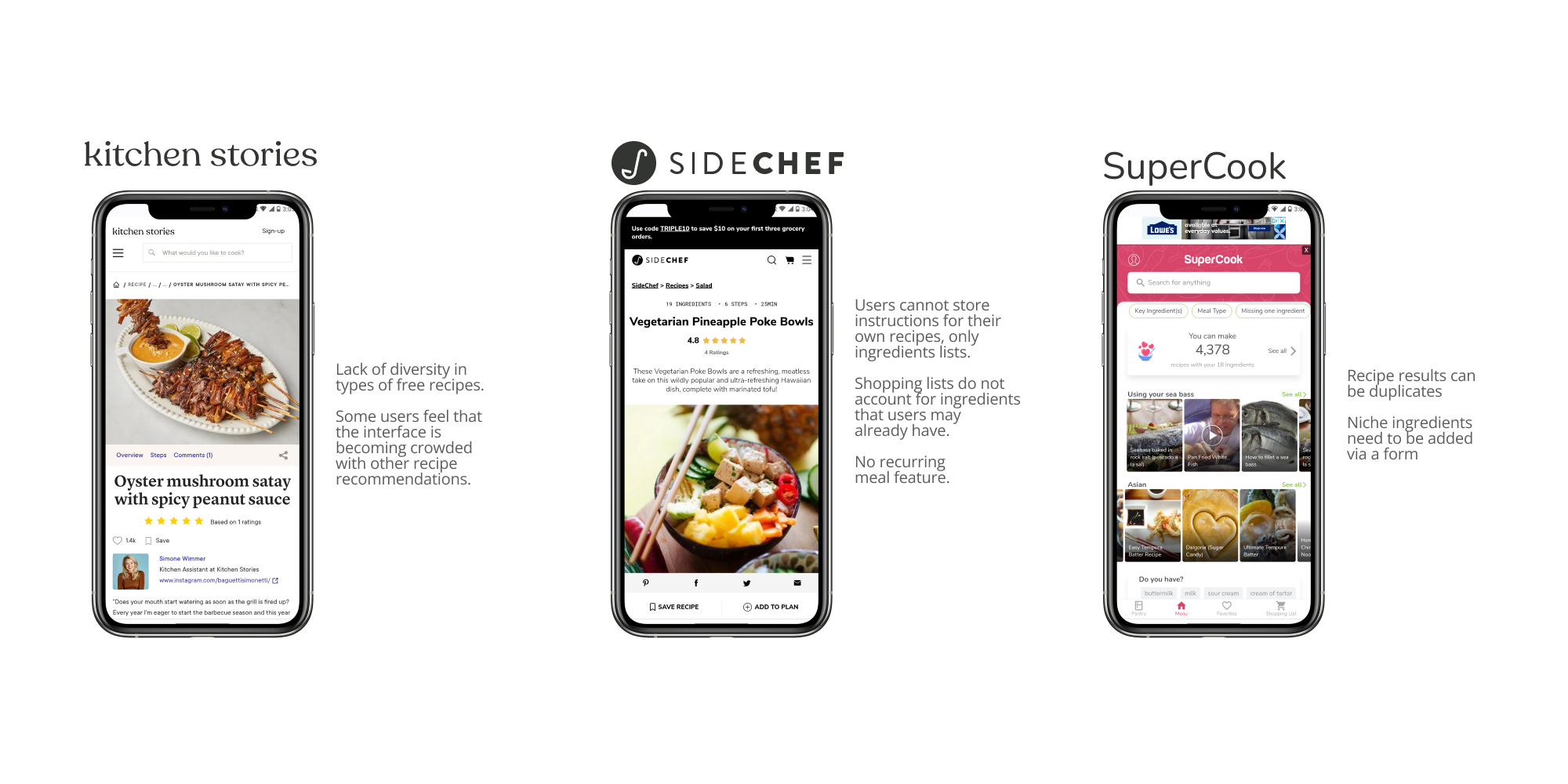
User interviews were conducted to gather a better understanding of their needs and goals related to using recipe apps. Personas were developed to help generate user scenarios that would be the foundation of the app's required functionalities.
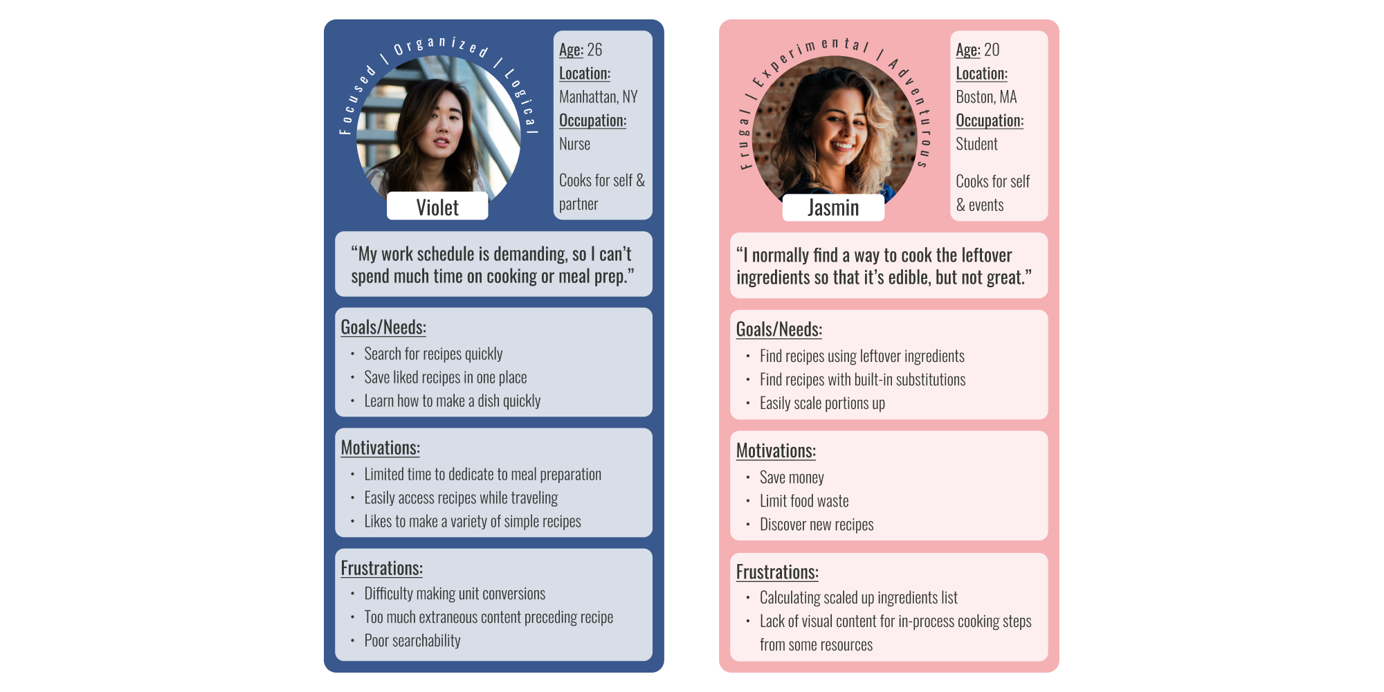
Utilize video for in-process steps
Easily search recipes
Access recipe content quickly
Scaling up meals
Using leftover ingredients
A variety of user scenarios detailing jobs to be done were sorted into needs and wants. The needs were translated into required app features as part of the minimum viable product document.
As a recipe learning app, Mini Chef needed to have a clean appearance that was organized and focused for users to stay on task. The app also needed a relaxed appearance to encourage users of all skill levels.
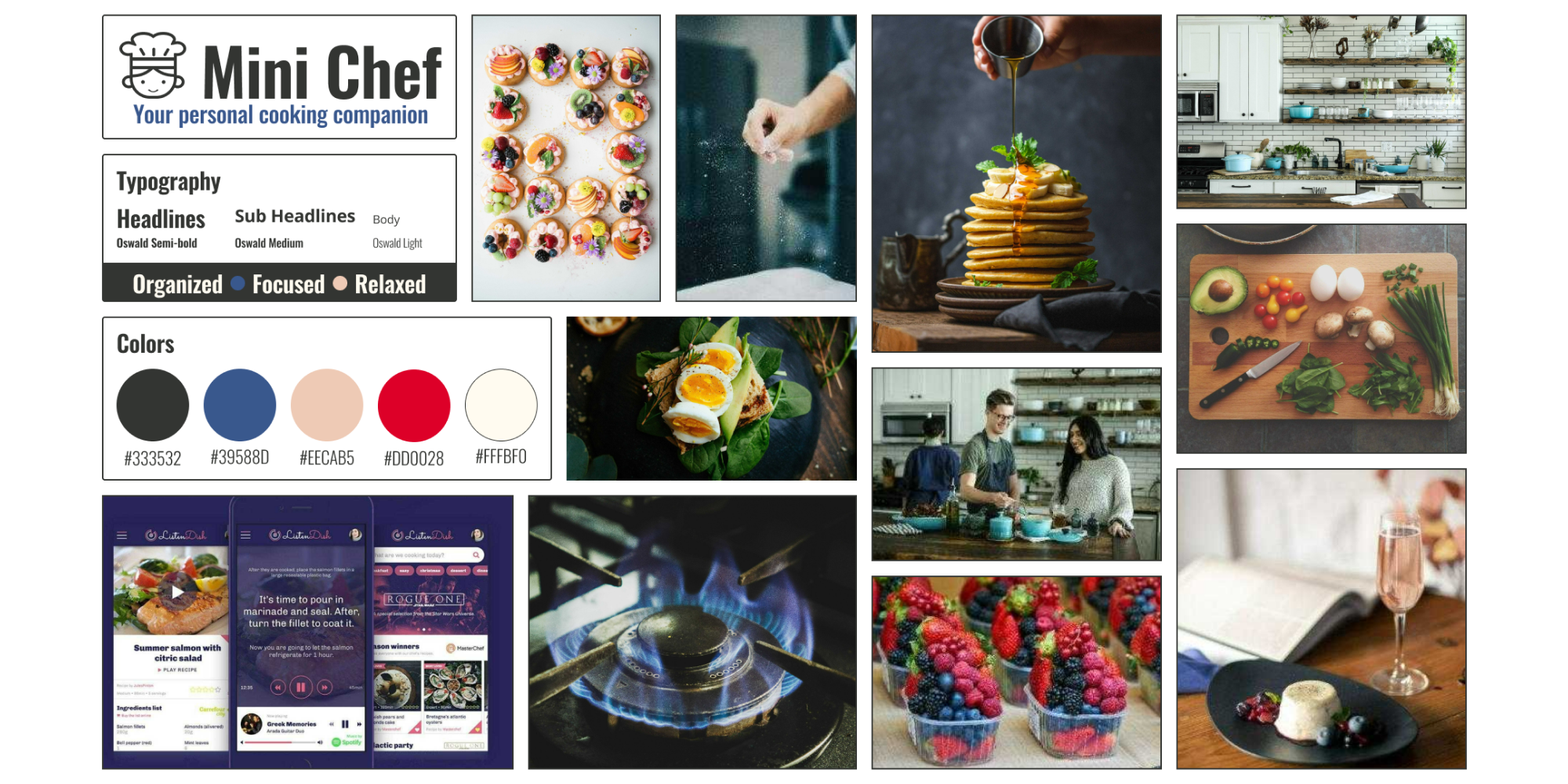
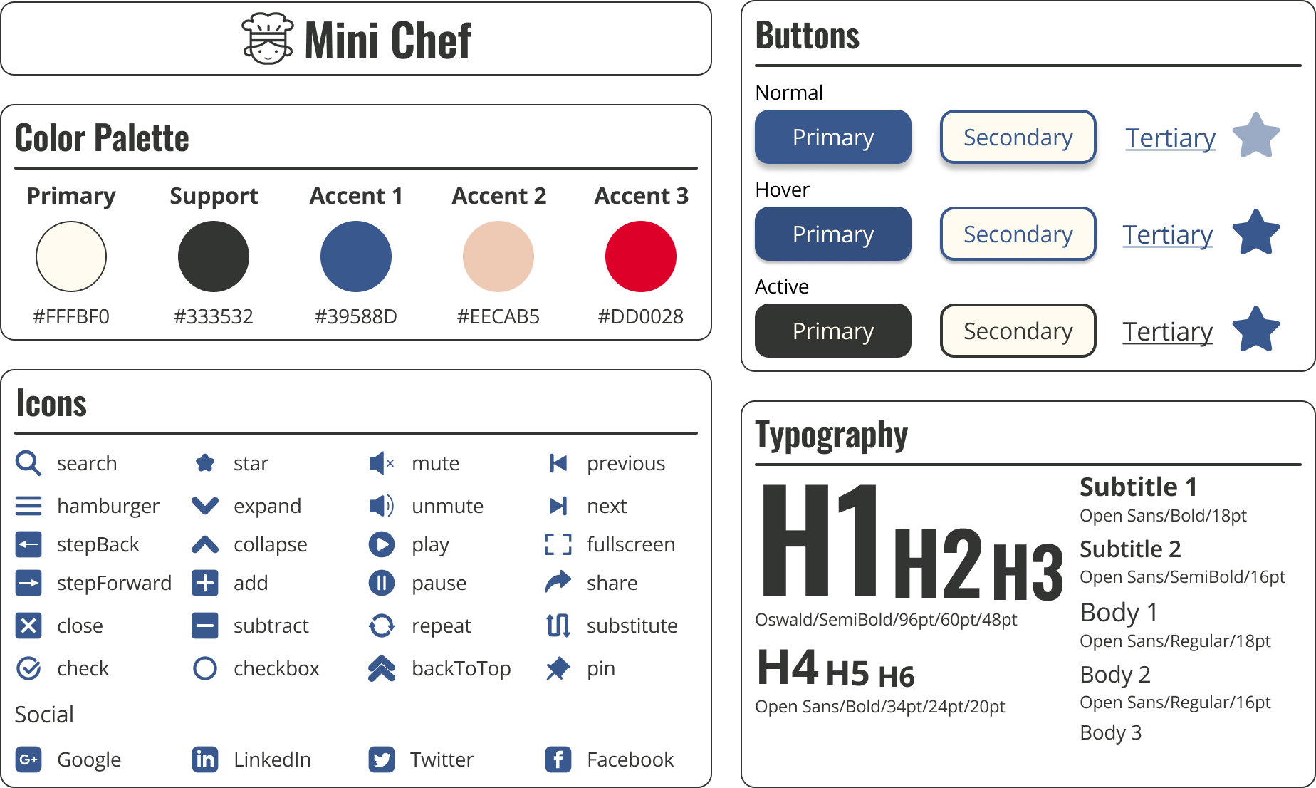
A style guide was developed for Mini Chef to ensure consistency between screens and as a good practice for maintaining styles for future updates.
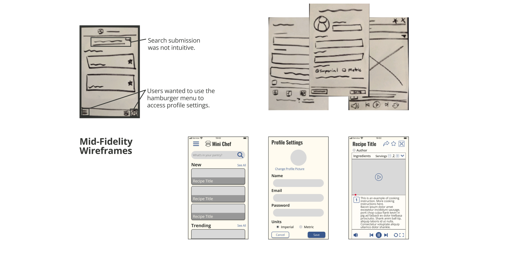
Low-fidelity wireframes were drawn for each user flow using the Crazy 8's method to proiduce a variety of screens. The final wireframes were prototyped in marvel for user testing. Major discoveries from testing included that users found the search submission unintuitive and that they wanted to use the hamburger menu to access profile settings.
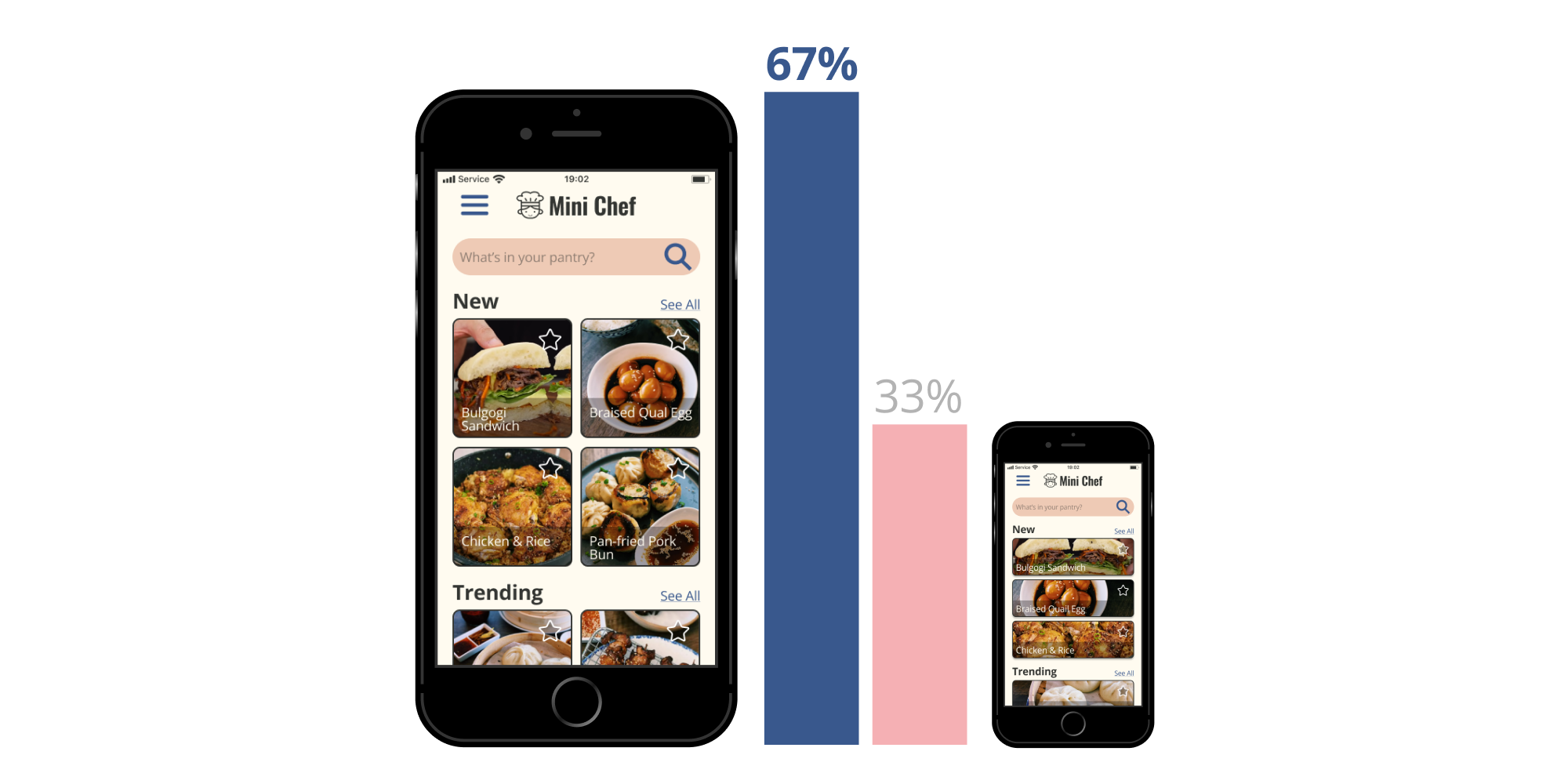
A preference test comparing a square card and rectangular card design indicated that the majority of users preferred square cards, resulting in a change of the design.
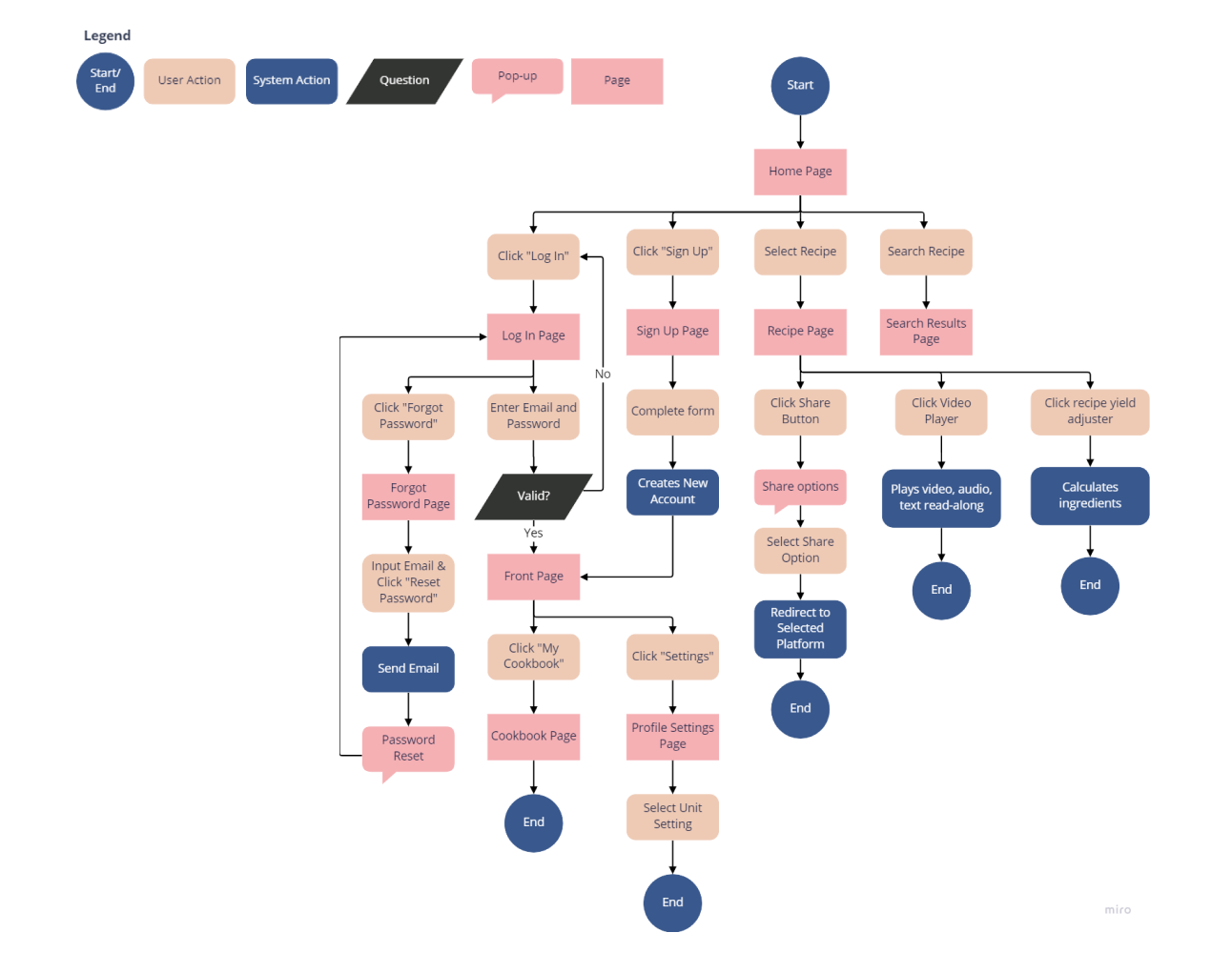
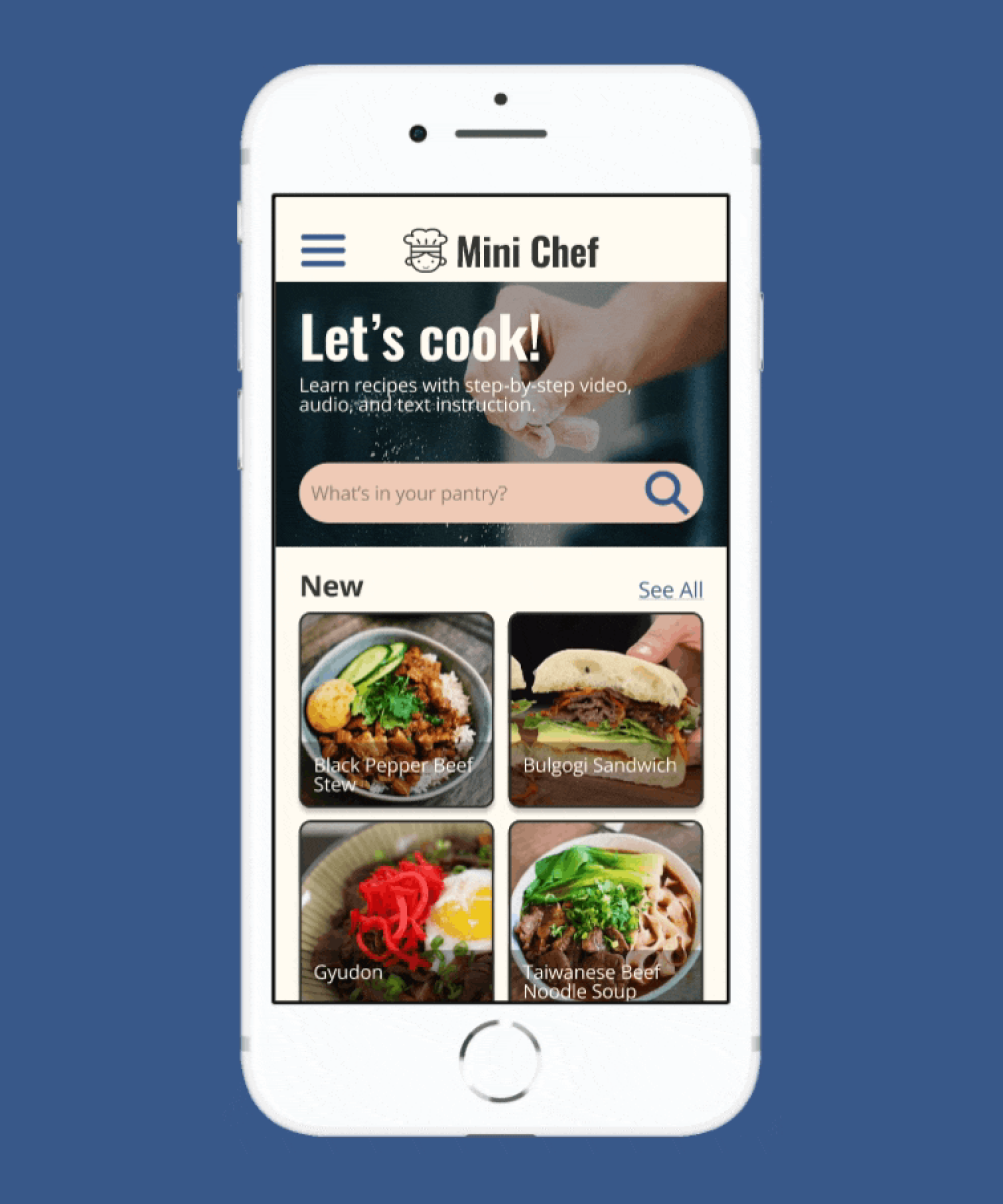
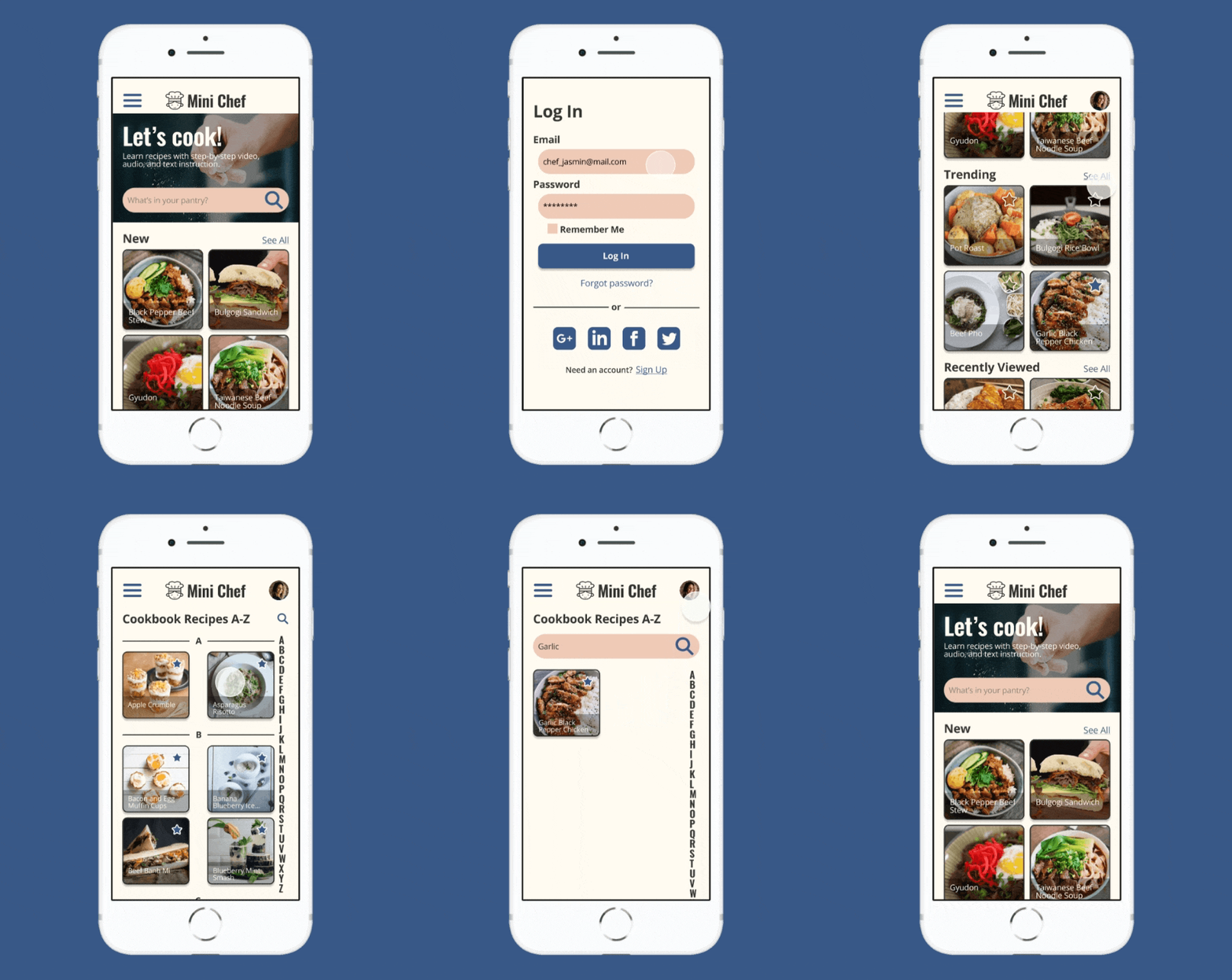
When looking for a recipe on Mini Chef, users can search ingredients they already have at home, or try something new by selecting a recipe on the front page. Once a recipe has been selected, the yield can be adjusted in the ingredients list. Users can also share their favorite recipes with friends and family from the recipe page.
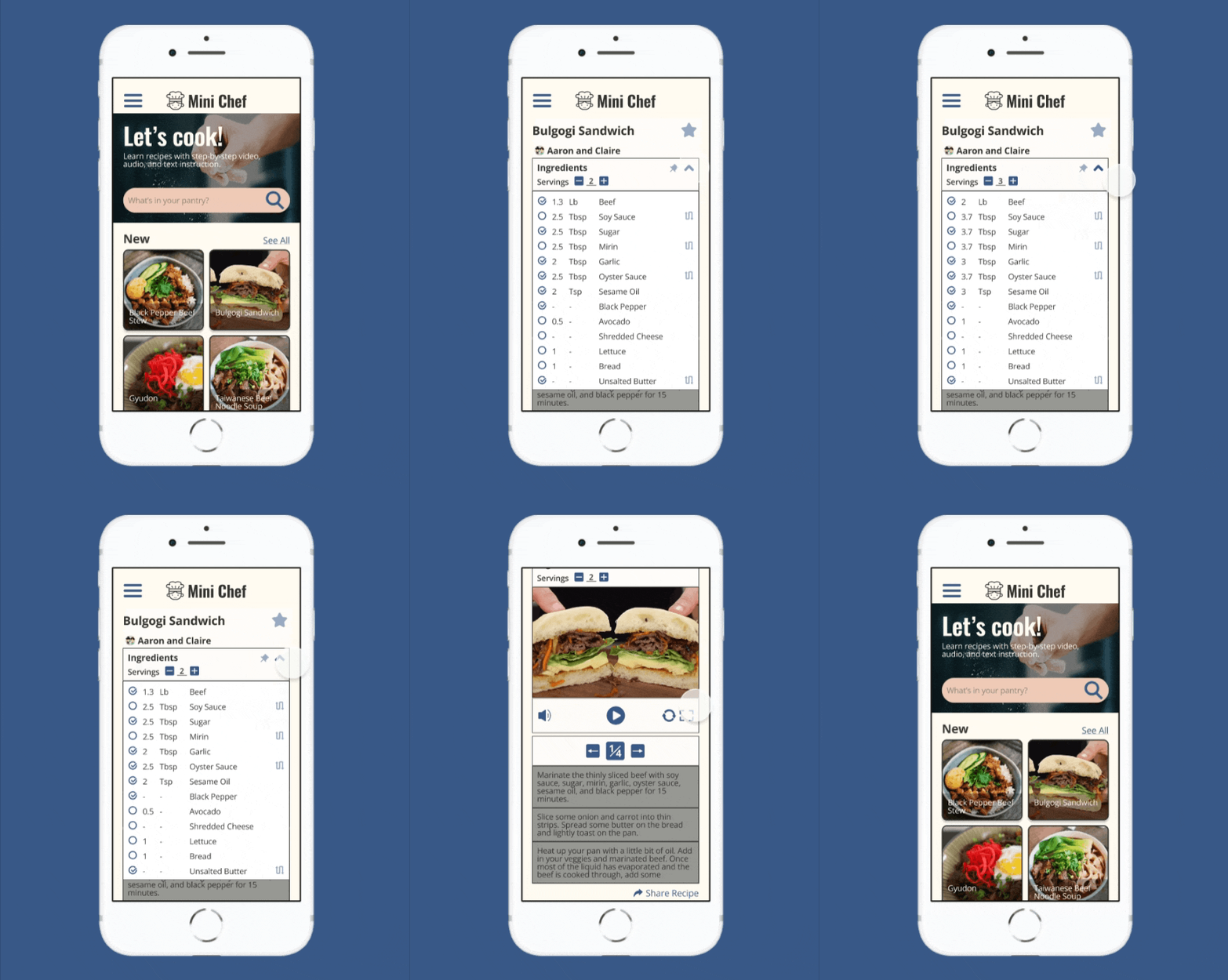
On the recipe page, users can follow along in three ways: watching a video, listening to the instructions, or reading along. Each step can be played on loop until the user is ready to move on.
With an account, users can access two features. The first is the ability to curate their own cookbook by marking favorite recipes. The second is selection of a unit measurement preference in the profile settings page.
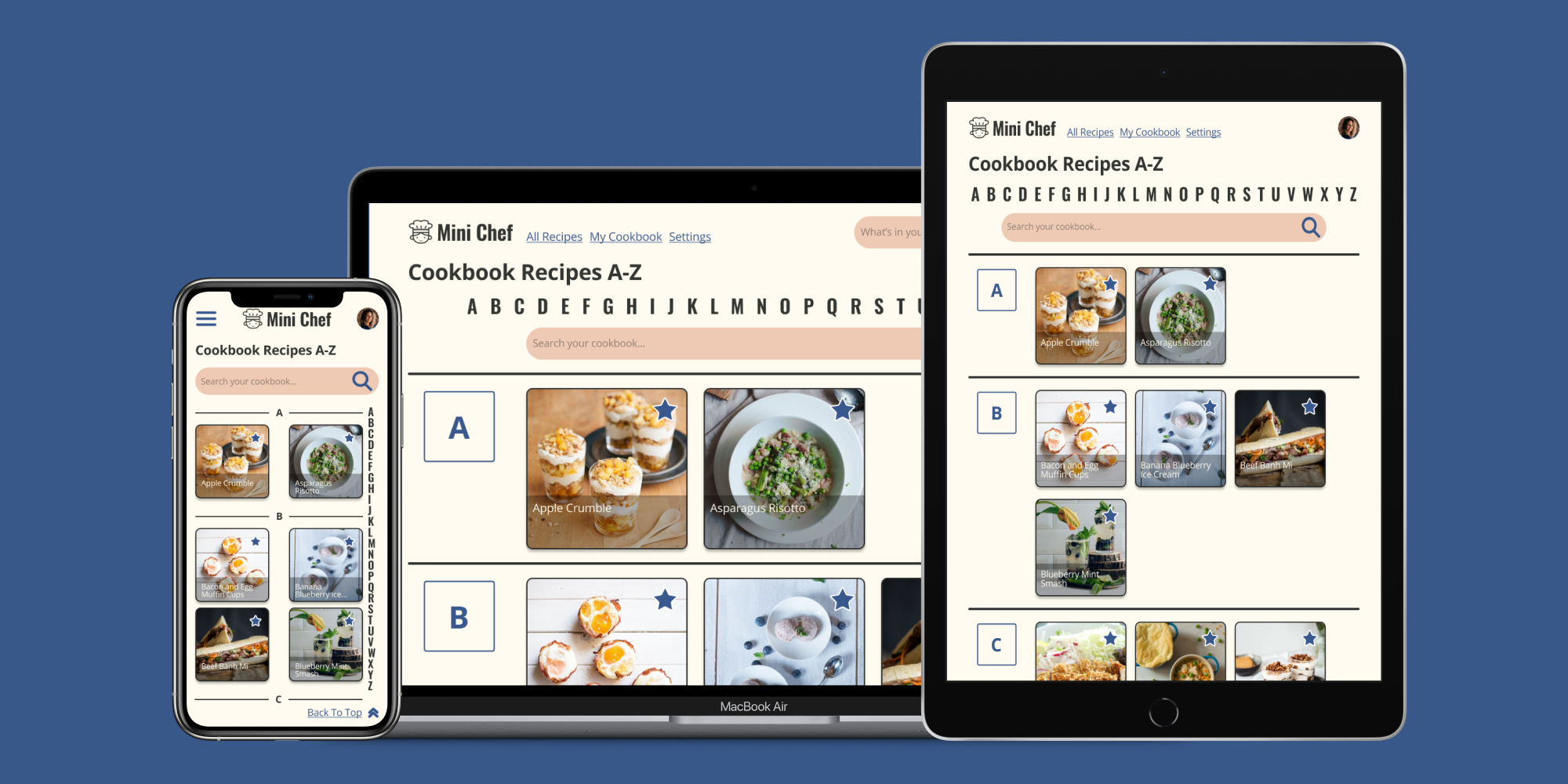
As a web app, Mini Chef needed to be responsive for mobile, tablet, and desktop screens. An adjusted design was made for each breakpoint.
Challenge assumptions