Anime and video game fans who attend conventions often highly anticipate paying a visit to the artists' alley, where they can discover new artists and purchase niche items that are unavailable in traditional stores. Conventions occur once a year and can be expensive to attend when considering badge and travel expenses.
How might we bring an experience similar to the artists' alley to fans whenever they want to shop?
Shopping made easy
Products that meet your needs
A shopping experience anywhere, anytime
Clean and dynamic

Discover artists and shop for new products every day.
Bring fictional worlds into reality with anime and video game-themed merchandise.
Support independent artists by connecting them with new fans.
The Anigamu logo iconifies the lucky fortune cat, an inviting character associated with wealth and good business in Asian cultures. On top of the Anigamu cat's head lies a gold coin, a representation of currency in video games (and real life), often rewarded for discovering treasure chests and earning achievements. The name comes from the combination of Anime + Games + You.
Purple is the dominant color that represents creativity and is associated with fantasy. Gold and black are used to evoke formality and bring attention to call-to-action buttons during the checkout process.

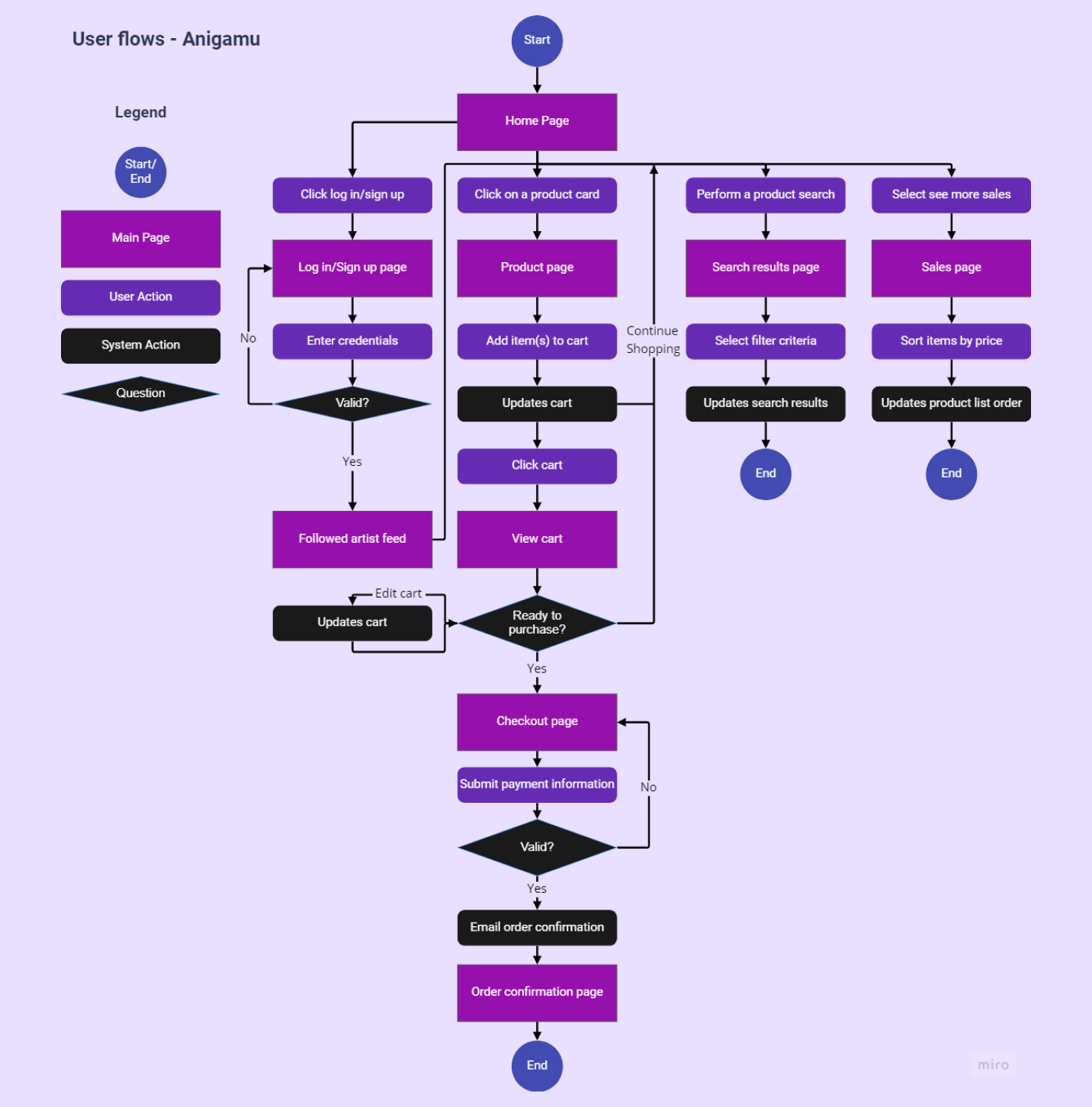
As a frequent customer, I want to receive updates from the artists I follow, so that I know if there are new products or sales to browse.
As a customer, I want to have access to advanced filtering options, so that I don't have to browse through a lot of products to find what I'm looking for.
As a customer, I want to be able to place multiple items in a shopping cart, so that I can purchase more than one item at a time.
As a customer, I want to be able to see when stock is on sale, so that I can save money.
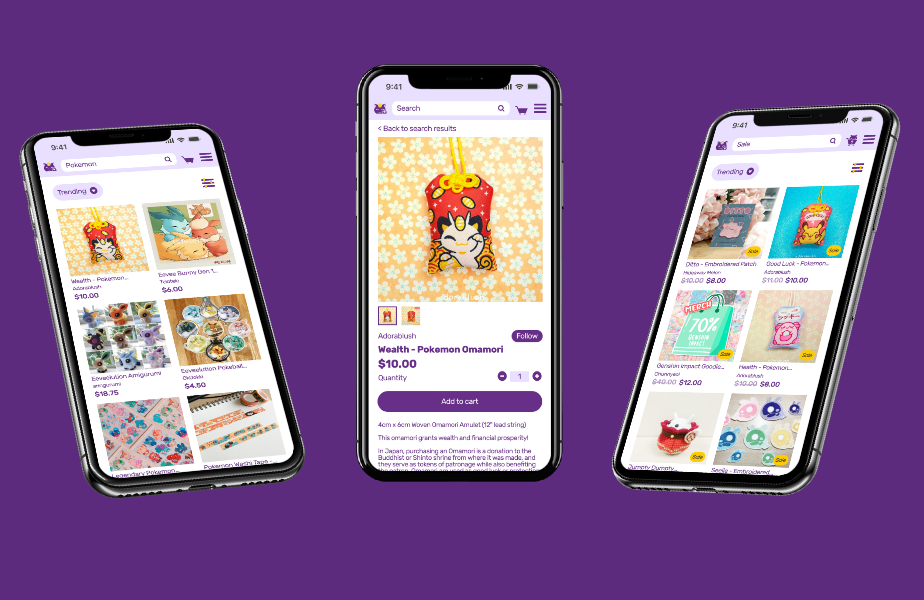
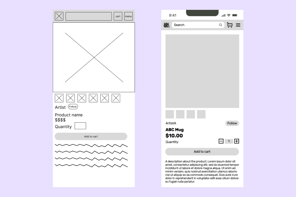
For the product page, I changed the quantity adjuster and added buttons for subtracting and adding items. I also changed the placement of the follow button so it could be in a consistent location on every product page.
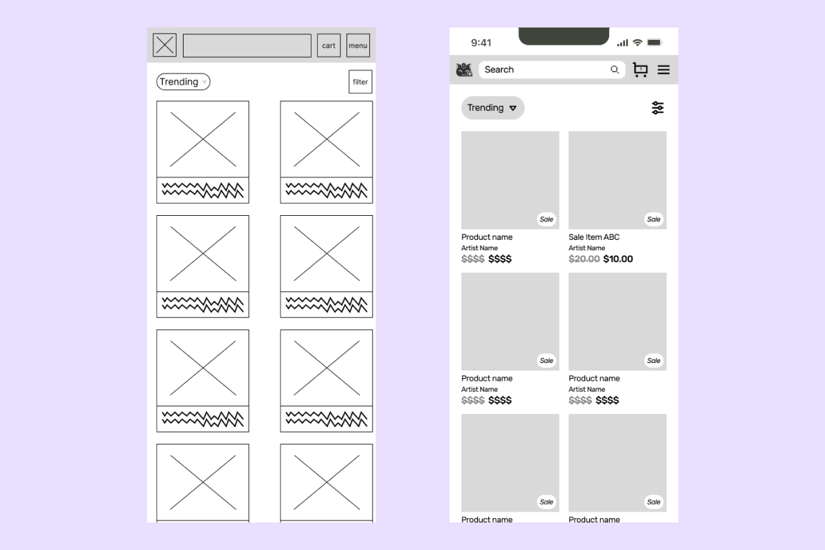
On the sales page, I hadn't considered how the product cards could look different for sales items compared to full-priced items. I wanted to make sales obvious to the user, as they are more likely to purchase and look for items they can save money on. In addition to crossing out and reducing the opacity of the original price, I added a sale tag on the bottom right corner of the image.
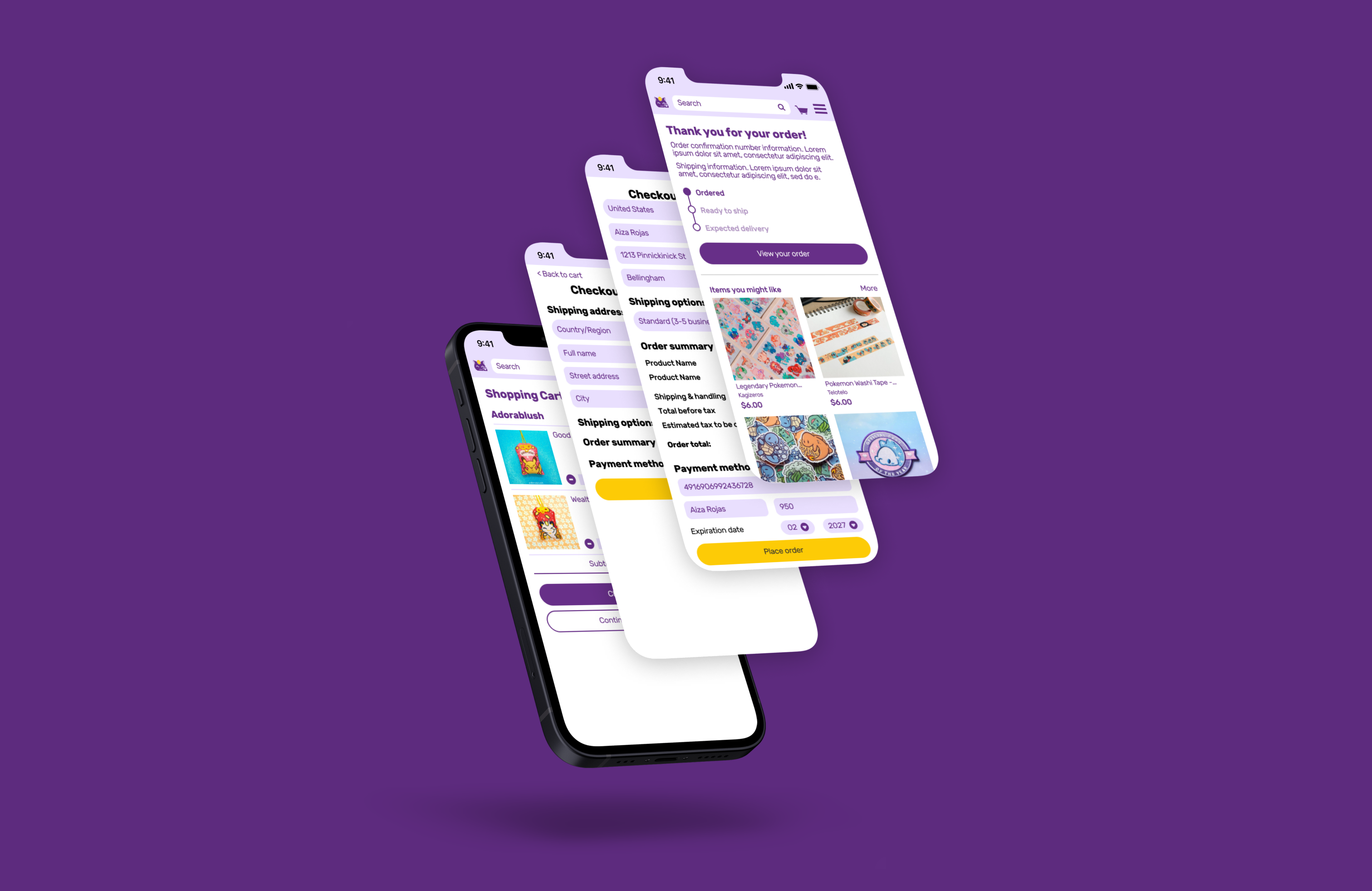
For the cart page, I decided to reduce the number of items to simplify the user flow and have a leaner process on how to show functionality.
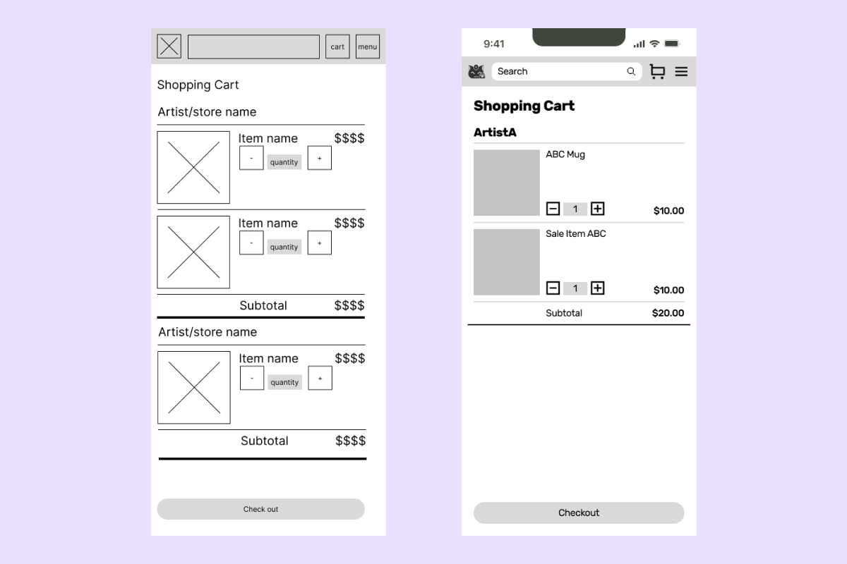
At the mid-fidelity stage, I created a prototype to test with four people. Changes to the final design based on feedback can be exmplified by four main screens.
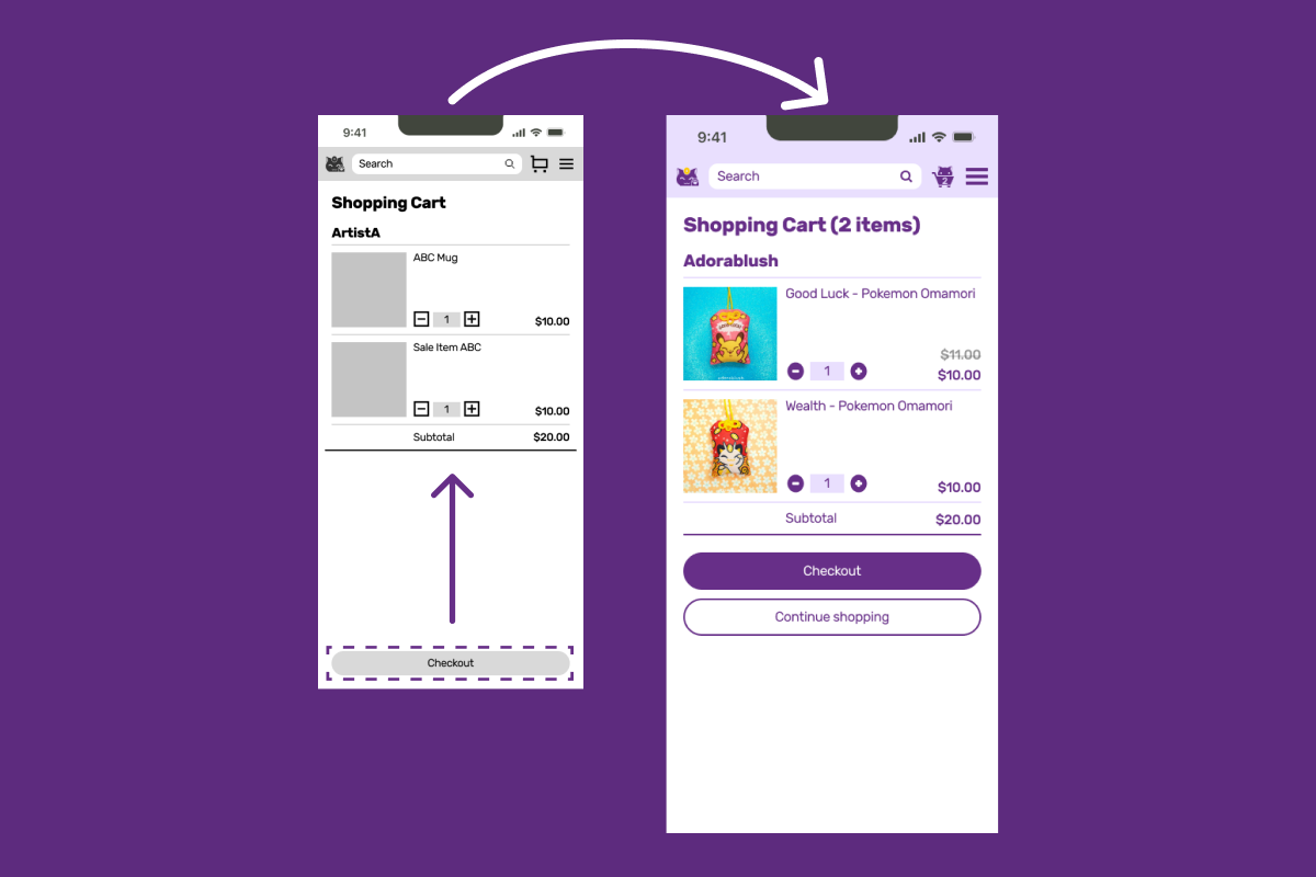
Users commented that they needed to scroll to find primary buttons when there was whitespace at the end of the shopping cart content. They also found the buttons to be narrow in height. This hindered their ability to proceed onto the checkout screen. To fix this in the final design, buttons were made larger and pushed to appear right after the shopping cart content.
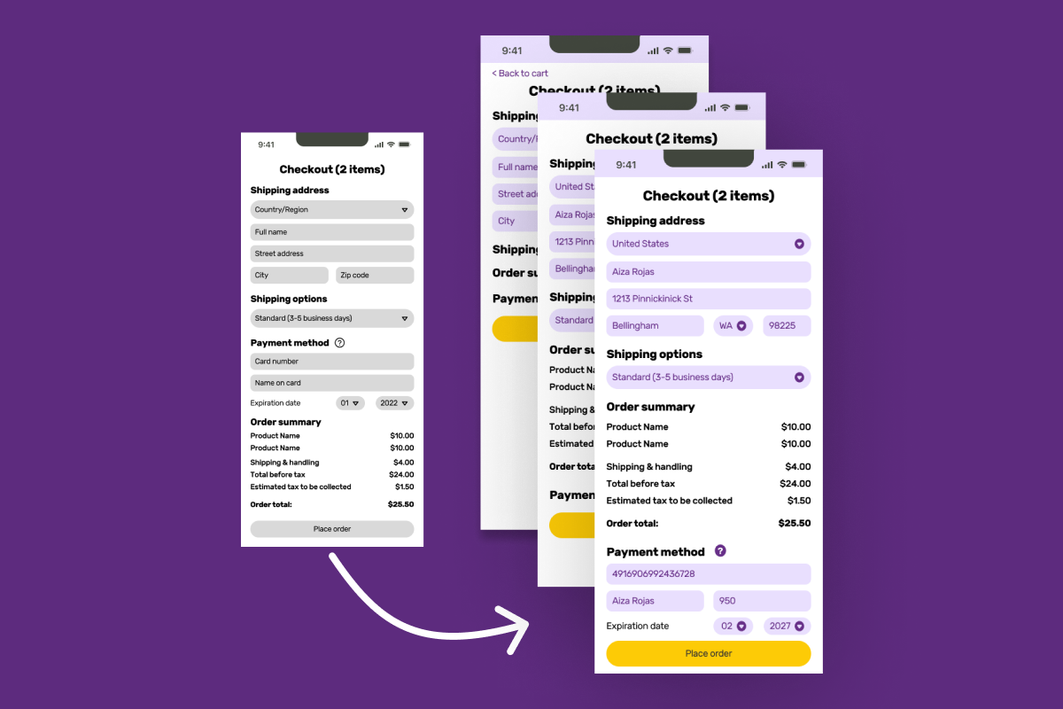
On the checkout screen, all of the required information for payment and shipping was immediately requested. Users felt that there were too many fields to complete at once, indicating that it could be overwhelming and deter them from finishing their purchase. To improve the checkout experience, the user input requests were separated into three steps.
A feature unique to Anigamu is the artist updates feed that appears on te front page after logging in. People felt that the original vertical scroll could be hard to use, especially on mobile devices. UI patterns such as pagination and drop-downs were explored, and the resulting pattern used is an activity feed that navigates to a different page if the user wants to access older content.

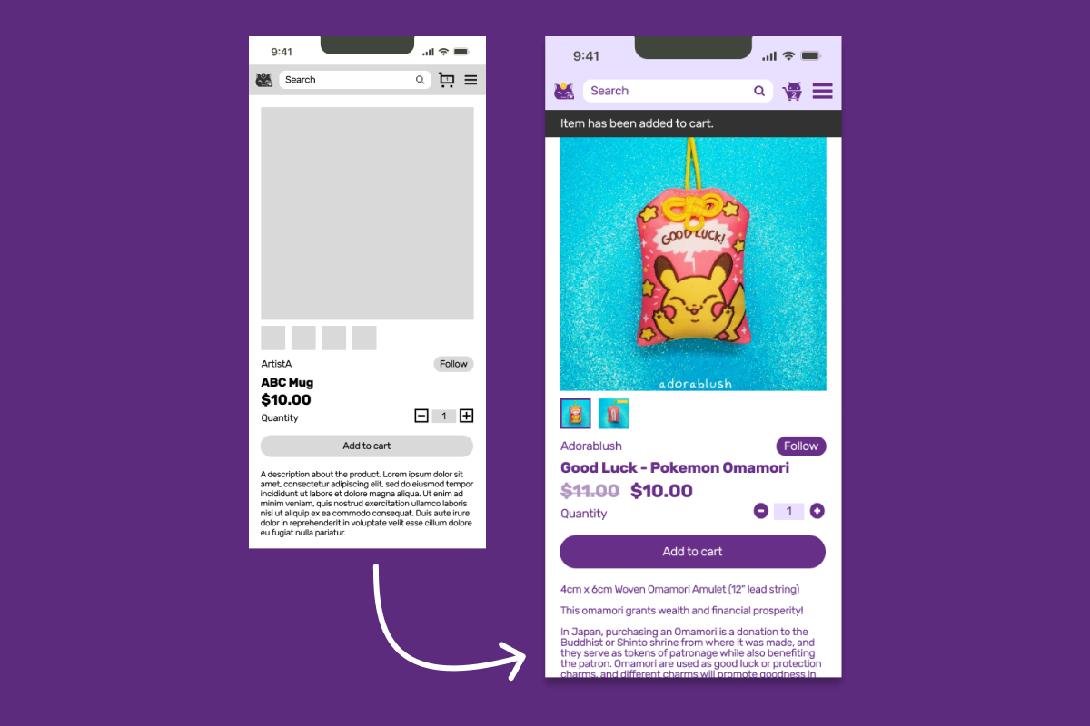
In the mid-fidelity prototype, users could add an item to their cart, resulting in a slight number change in the cart icon. The change on the screen was too subtle, and some users were confused about if they had successfully added an item. A black notification banner under the top menu and a more significant cart icon change were added.
To further enhance the user experience of the ad-to-cart interaction, I animated the button. Keeping the guiding principles of the brand in mind, I aimed to design an animation that contained elements of discovery and delight featuring the brand mascot.


